
AARP Visual Identity
© 2020, Siegel+Gale
© 2020, Siegel+Gale
Overview
With its guiding mission of "empowering people to choose how they live as they age," AARP has incredibly strong brand recognition. But target audiences weren't aware of all that the organization delivers, neither nationally nor in local communities. Simply put, AARP needed to shift perceptions beyond the idea of retirement.
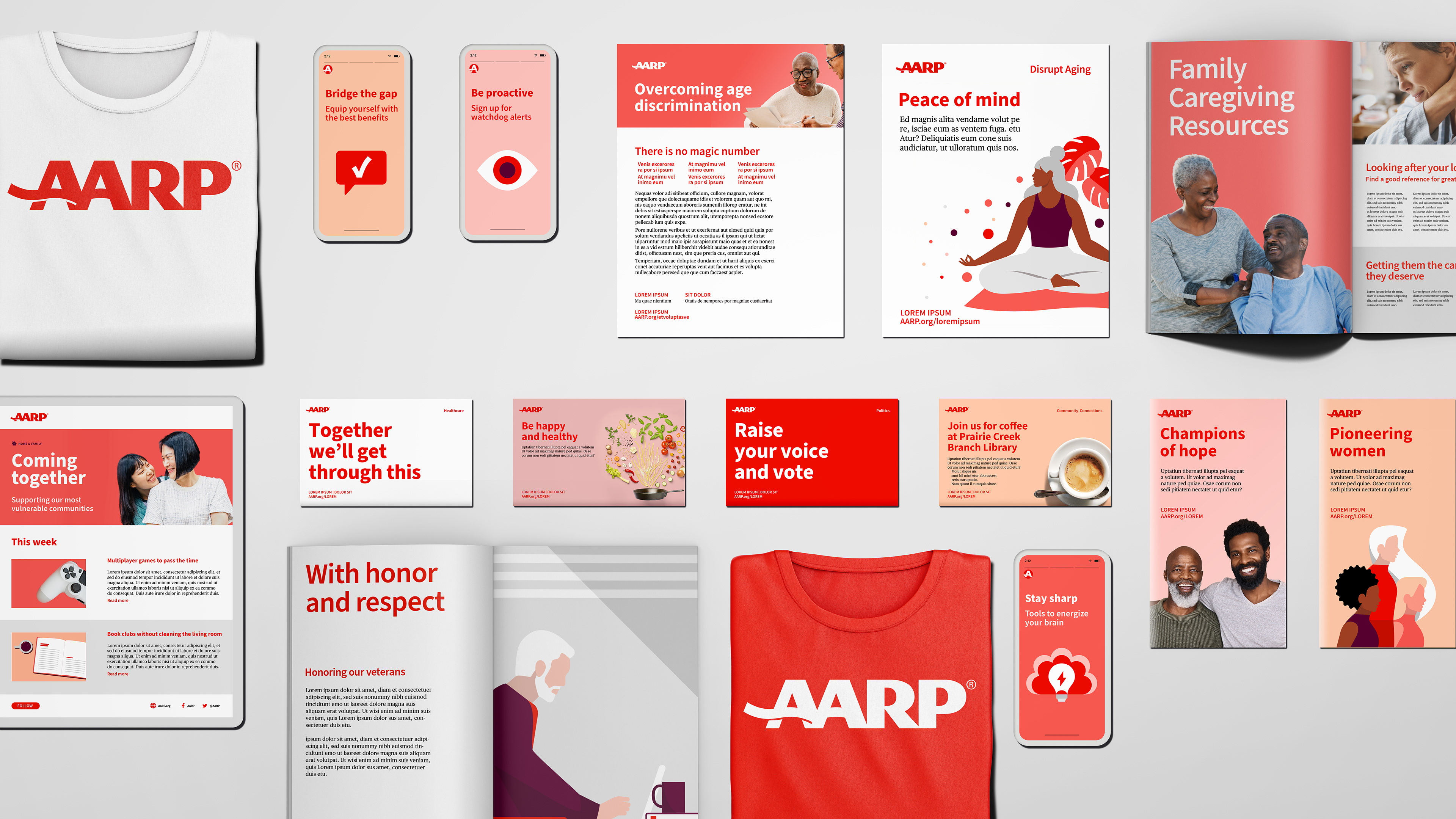
We knew that AARP could stand out by standing together. So our first step was aligning the organization around a core brand idea: Wise Friend & Fierce Defender. The idea defines the role that AARP plays in its members' lives, and it gave us the strategic and creative springboard we needed to refresh the brand's verbal and visual identity—and, ultimately, its brand experience.
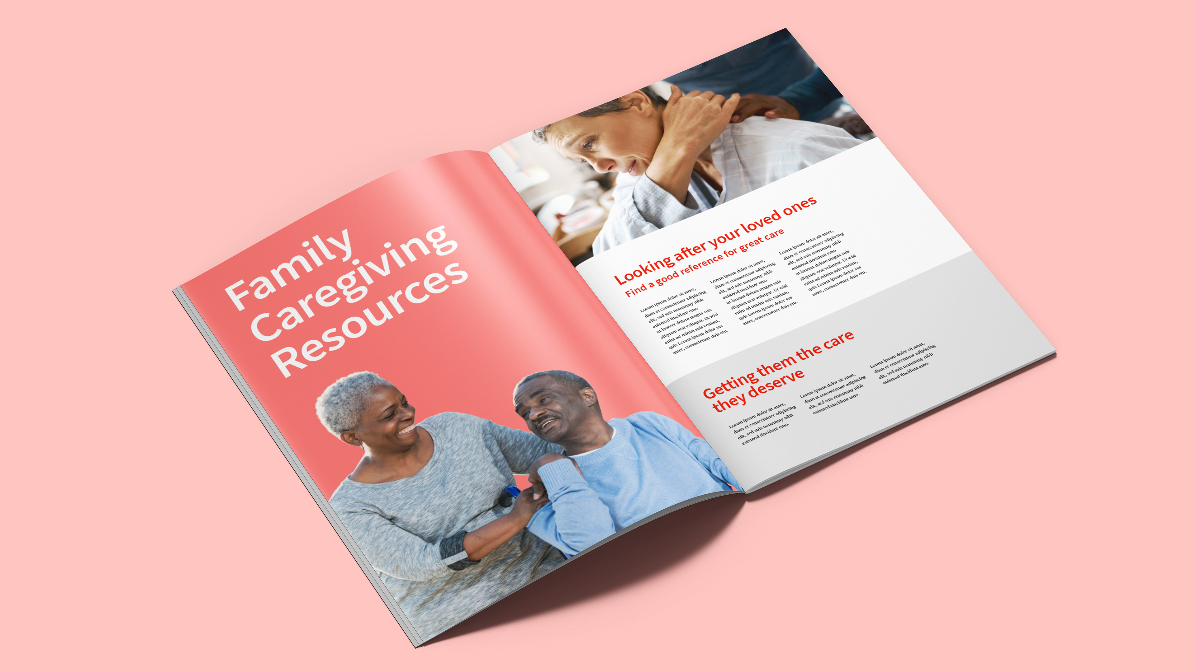
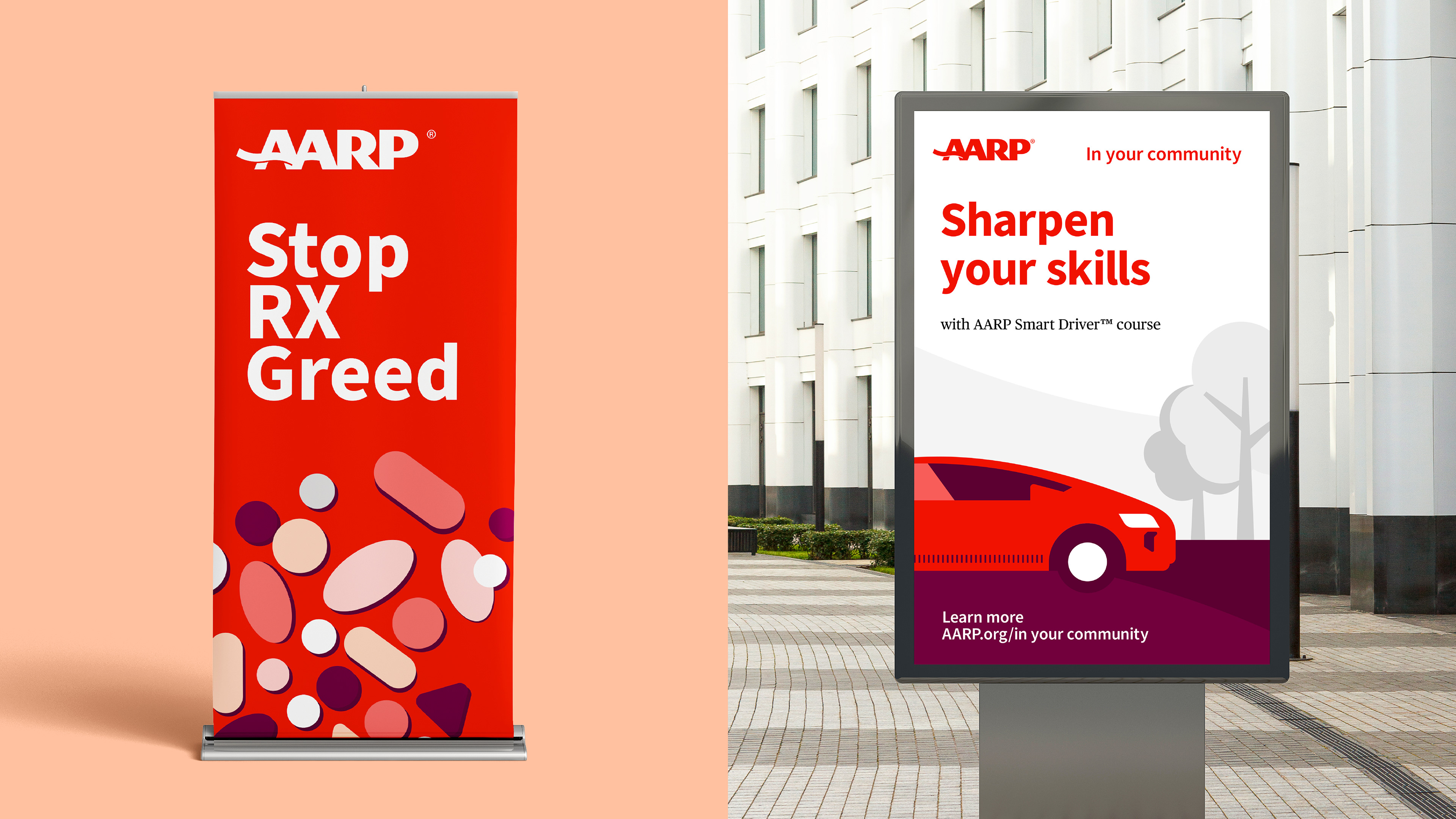
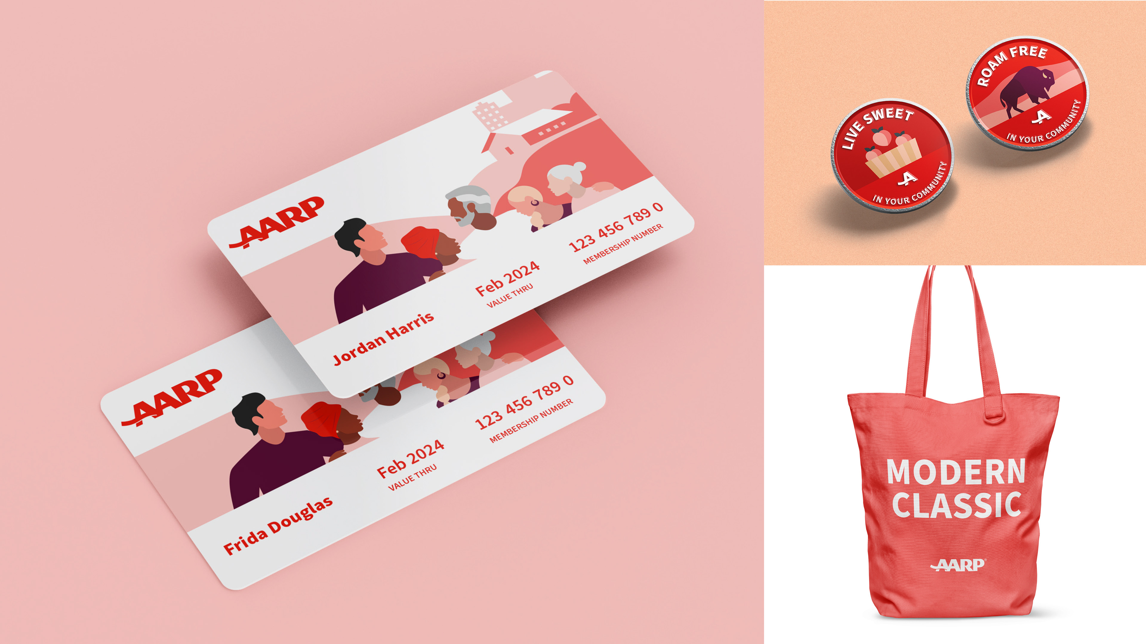
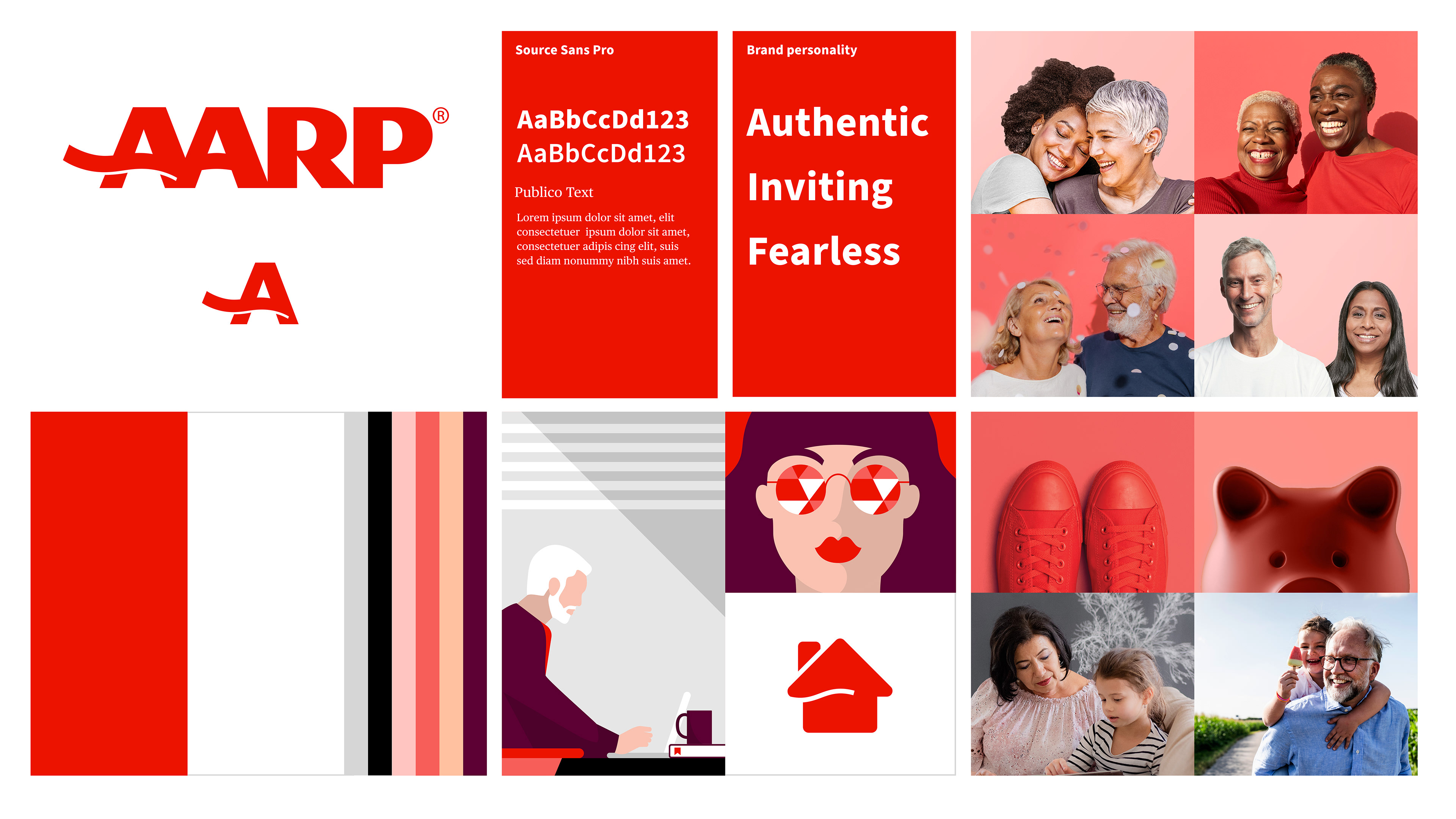
With the idea of Wise Friend & Fierce Defender in hand, we redefined AARP's brand voice and developed a simpler, call-to-action-oriented brand narrative and messaging strategy. We also rebuilt AARP's visual identity, revamping the brand's signature red and iconic logo while dramatically simplifying all other visual elements, including color palette, typography, iconography and photography style.
The brand's new verbal and visual elements create a fresher, cleaner and far more powerful brand experience. Together, they enable AARP to communicate the breadth and depth of its offerings in a much more focused, member-centric way.
We also reinforced AARP's new identity with a concise set of design principles, which guide and inspire internal teams to deliver a coherent, consistent brand vision.
Creative Director
Austyn Stevens
Design Director
Nijel Taylor
Collaborators
Jonathan Correira
Brooke Pathakis
Austyn Stevens
Design Director
Nijel Taylor
Collaborators
Jonathan Correira
Brooke Pathakis