
Canandaigua National Brank
© 2025, Hale Design
© 2025, Hale Design
Overview
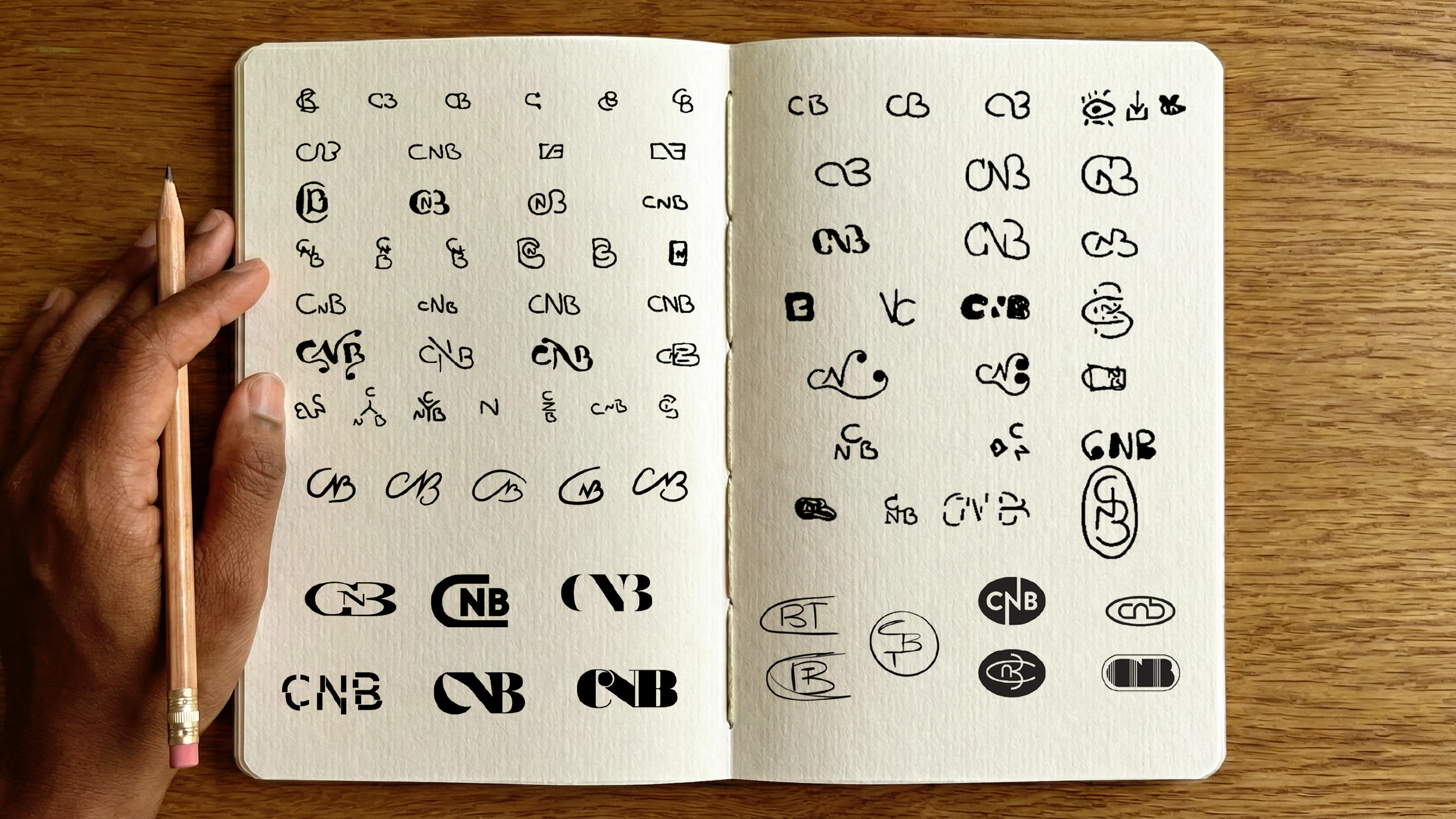
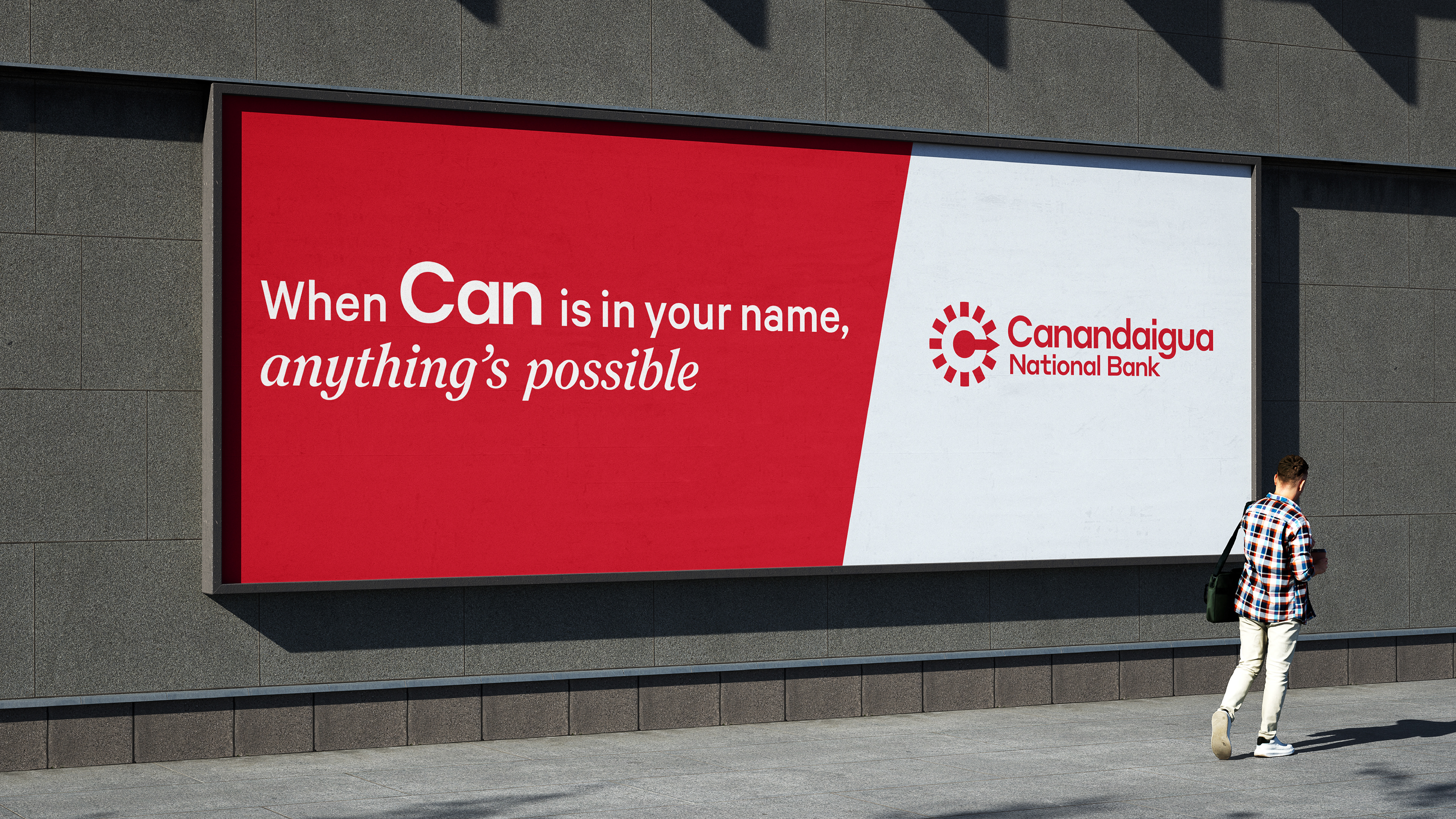
In partnership with the amazing team at Hale Design, I helped develop the logo identity for Canandaigua National Bank.
Under Su Hale we evolved their heritage brand with a new logo and design system –rooted in their legacy with a clear eye on the future.
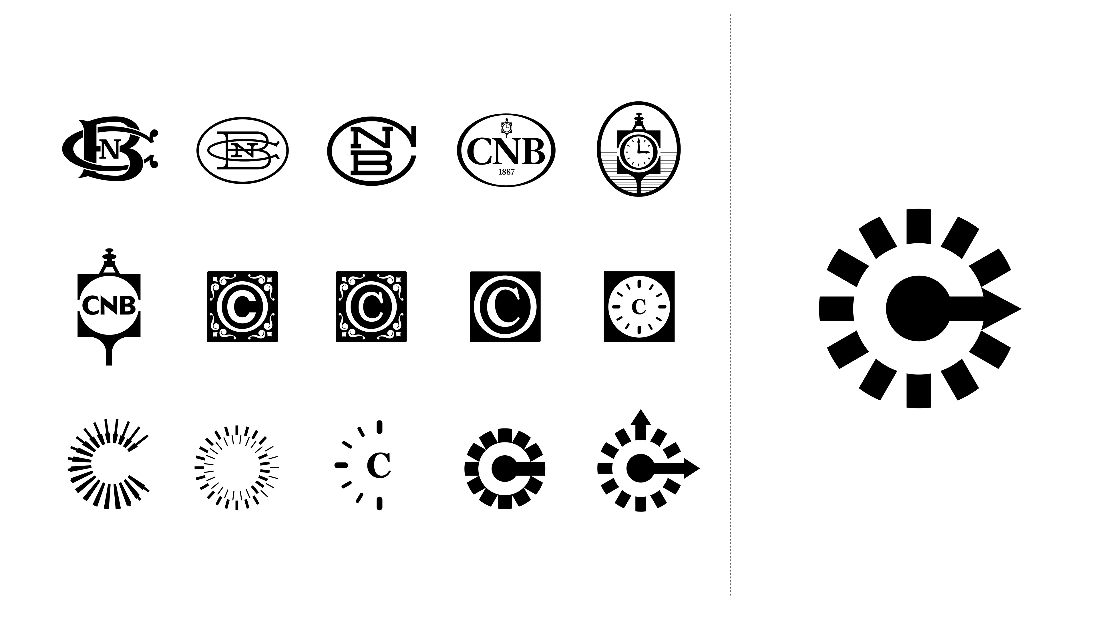
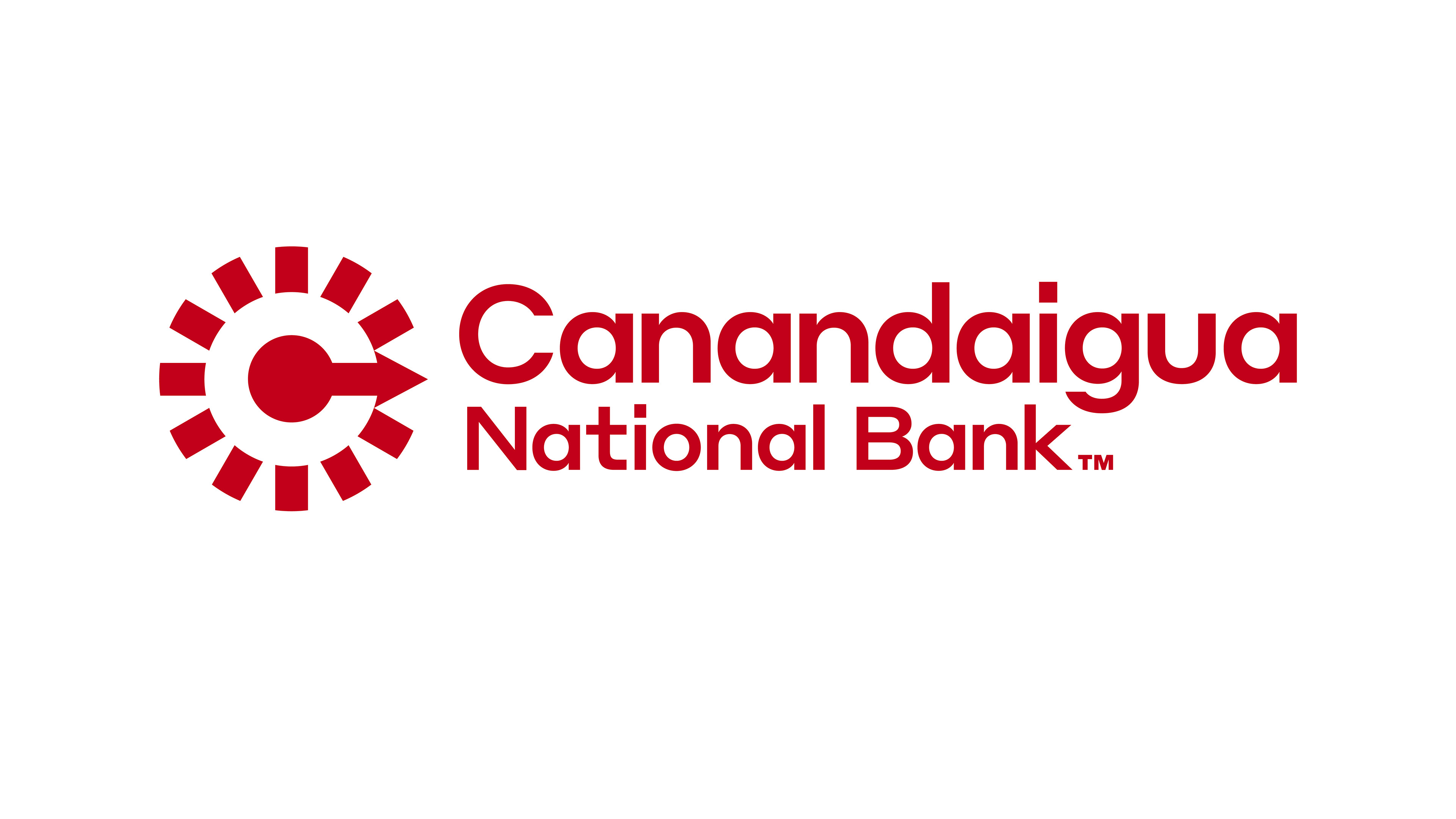
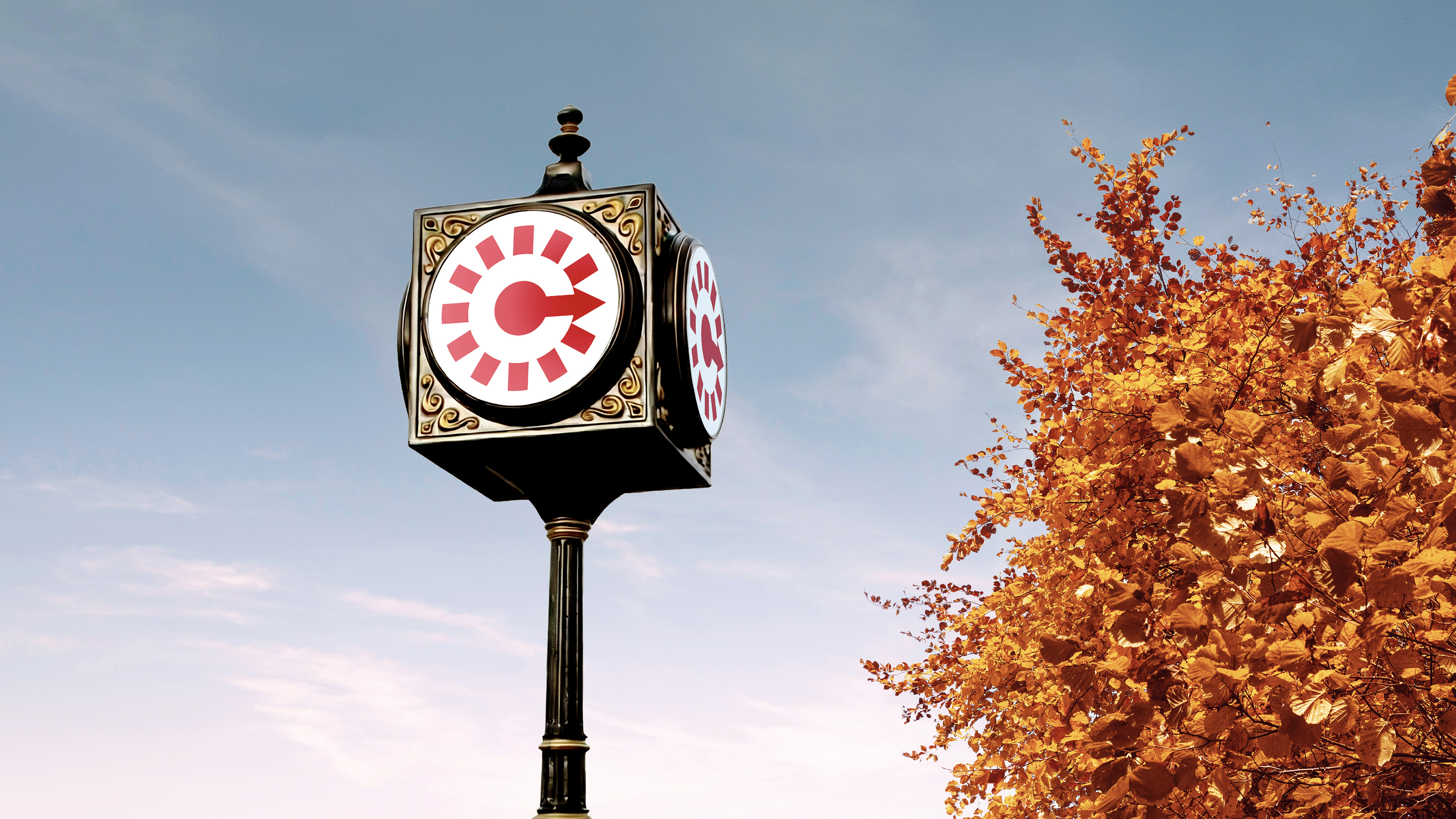
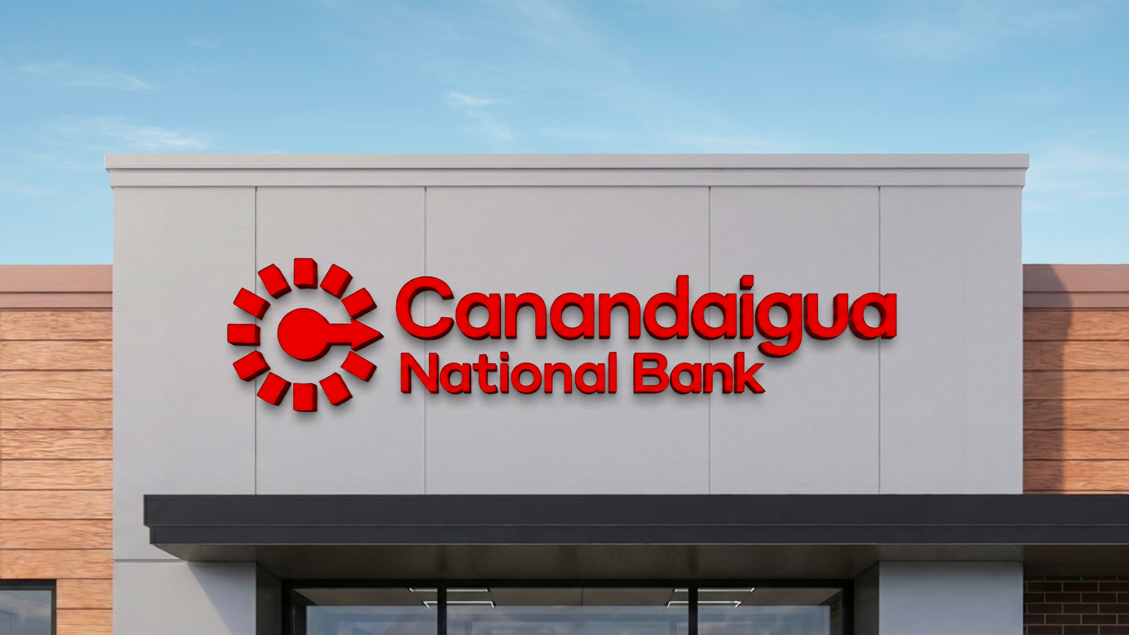
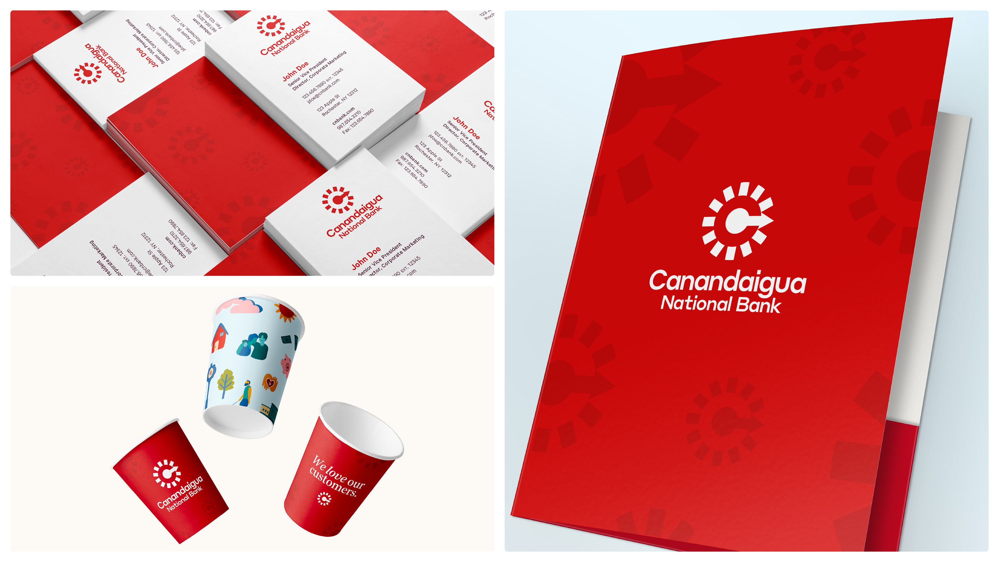
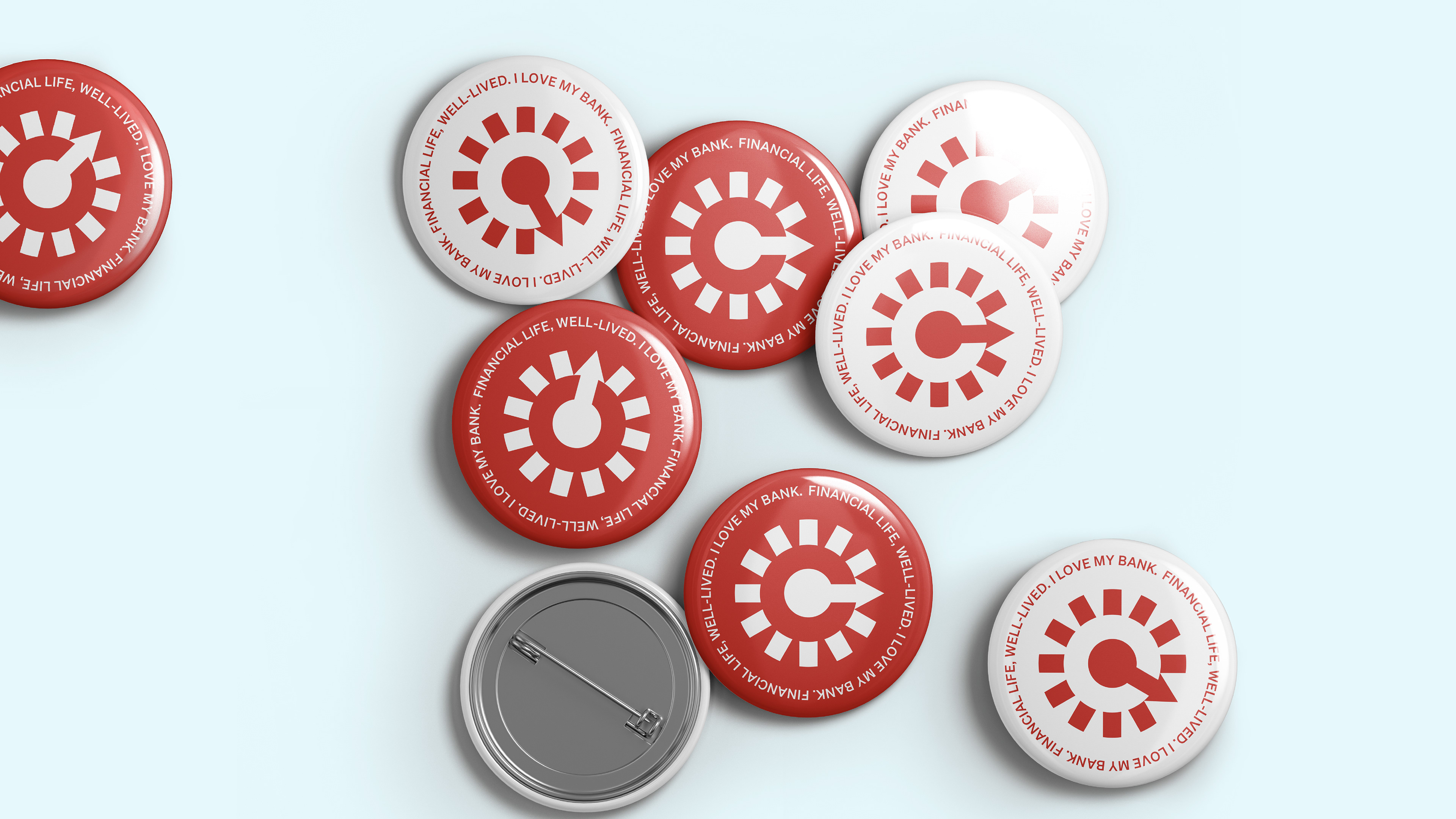
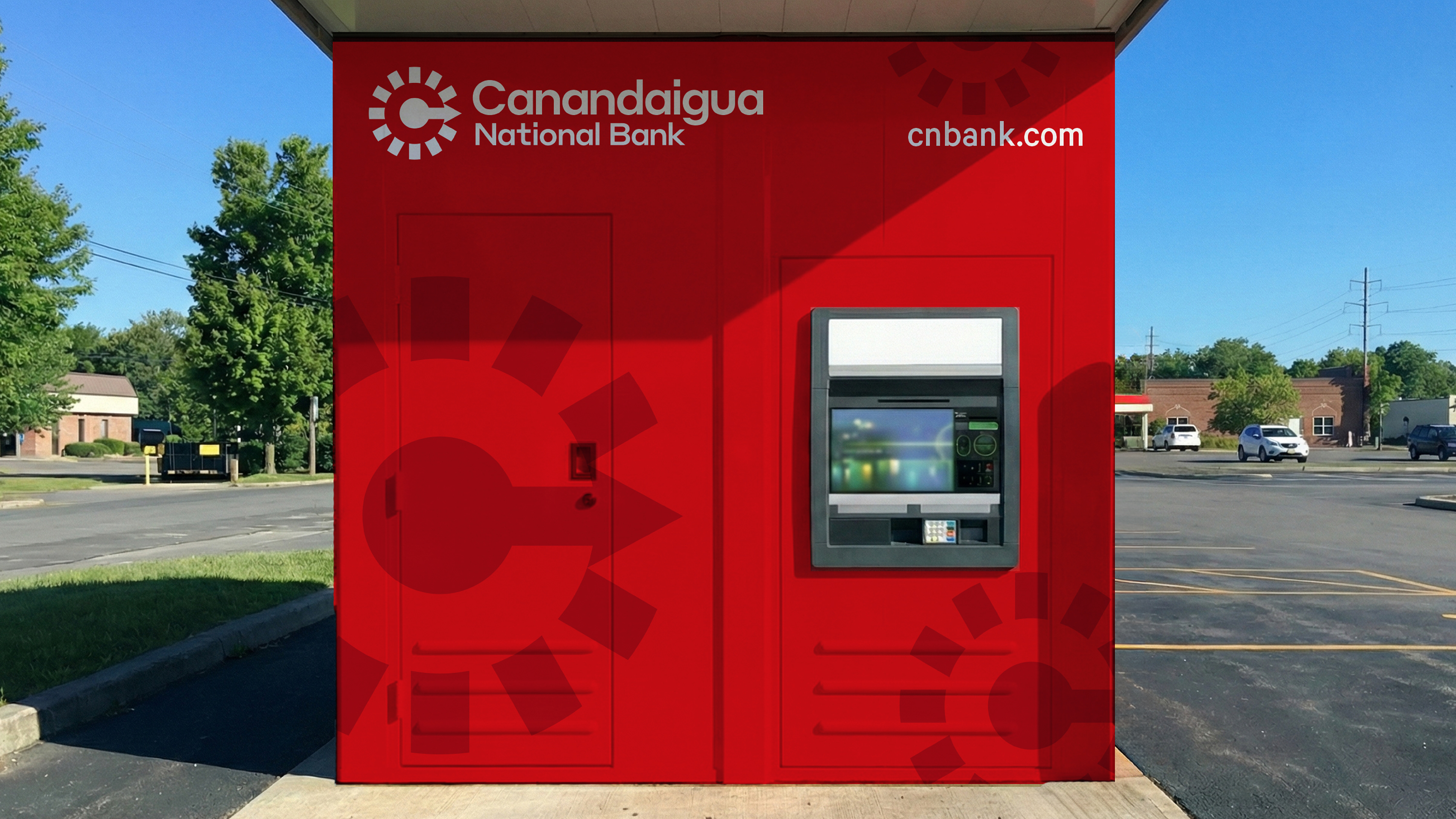
We leaned into what makes them unique, putting Canandaigua front and center with a clean, modern wordmark that’s friendly, approachable and bold. At its side is an evolved monogram. It is an abstract symbol inspired by their iconic clocks seen all throughout the communities the banks operate in. The ticking hands not only create a sense of movement and energy–echoing the vitality of the people they serve–but it also forms a subtle “C” in the center of the mark, a quiet yet intentional tribute to the Canandaigua National Bank name.
Chief Creative Officer
Su Hale
Creative Director
Nijel Taylor
Collaborators
Zöe Murray
Kevin Kan
Kyle Davis
Danielle Tracy
Su Hale
Creative Director
Nijel Taylor
Collaborators
Zöe Murray
Kevin Kan
Kyle Davis
Danielle Tracy